Blog 2

This photograph is called Dawn and it was taken by Keith Carter. What drew me to this photo was the black and white coloring, along with the fogginess and blurriness of the image. Even though the photo only uses the colors black and white, it really makes and impact and stands out. Keith uses variations of light and dark to produce a visual texture in which the building seems far away and 3D in a sense; it is almost like an optical illusion for the viewer. The bottom of the photograph is darker and as you go up it gets lighter. Also, the ouside is more blurry and as you go toward the center it gets clearer, which gives the photograph a mystical and mysterious quality. The transition from dark and light in the photograph make horizontal lines. Thr white lines that distinguish the walkway cause the viewer to focus their attention on the man and the building ahead, and outside these lines the image is verr cloudy looking. The different shapes on the building, such as the arched walkways, pointed tops of the building, and the semi-circle on top, make it seems as if the mans destination is a castle, and ultimately cause you to question where the man is headed.  The large amounts of blank space draw the viewers attention first to the man and then to the place he is headed in the background. I think Carter utalized the different visual elements to produce a very captivating photograph.

Posted in Uncategorized | Leave a comment

Assignment 1: Part B

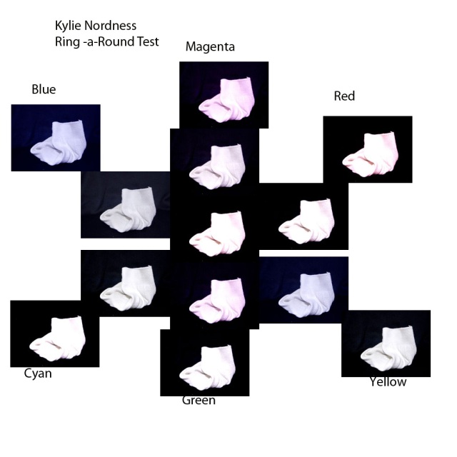
1.) No, the “correct” photo no longer has the best color balance. I think the +10 blue color balance works and looks better.

2.) The comparative test revealed that different colors emphasize different parts and details of the image. The different colors shadow and highlight different parts of the image.

3.)Like me, my classmates also discovered that the original photo might not always be the best one, and after employing the ring-a-round test they found that they like the image with different color balances.

Posted in Uncategorized | Leave a comment

Assignment 1: Part A

1. Why would we use a white object?

When you use a white object you are able to compare different exposure values. With a white object you can most easily see and capture how changing from positive and negative exposure values affects the lighting and creates different shadows on the chosen image.

Which EV works better for…

White objects on white? +1

White on black? 0

Black on black? -1

2. After viewing the images and interpretations of my classmates I found that we share similar viewpoints about the assignment.  My best exposure values were the same for most of my other classmates. For black on black, my classmates and I found that negative EVs, mainly -1 and-2 looked the best. For white on white positive EVs, mainly +1 and +2,  looked the best.

Posted in Uncategorized | Leave a comment

Blog Post 1

http://www.artic.edu/aic/collections/artwork/184990

I chose the photo Jill and Polly in the Bathroom by Tina Barney. I liked this photograph because it stood out to me and caught my eye because it is a very vibrant picture with a lot going on. The pink colored walls and robes and the flower patterned curtains give off a feminine vibe. I like the clutter of hair products and make up scattered around the sink because it illustrates all the time and effort girls put in to pampering themselves. I like this picture because I think it is relatable to me and my life. I love getting ready with my friends and spending so much time trying to make my make-up and hair look perfect. After we are done getting ready, the bathroom is always a disaster and our stuff is scattered everywhere. Overall, I think this picture is fun, girly, and all too typical for most teenage girls.

Posted in Uncategorized | Leave a comment

Hello world!

Welcome to WordPress.com. This is your first post. Edit or delete it and start blogging!

Posted in Uncategorized | 1 Comment